


Why the Right Font and Paper Can Change the Look of a Wedding Invitation
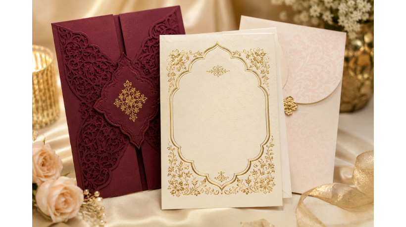
A wedding invitation is often the first physical glimpse guests get of your celebration. Before they see the venue, flowers, outfits, or décor, the invitation introduces the mood of the wedding.
That is why small design decisions matter. The typeface, paper texture, thickness, finish, spacing, and printing style can completely change how an invitation feels in someone's hands.
A beautifully written invitation can look formal, modern, traditional, playful, or luxurious depending on these details. The goal is not simply to make it attractive. It is to make the invitation feel connected to the couple and the celebration.
Start With the Mood of Your Wedding
Before choosing a font or paper, decide what kind of feeling you want the invitation to create.
A traditional wedding may suit an elegant serif typeface and textured paper. A contemporary celebration might look better with clean lettering and a smooth finish.
Match the Design to the Occasion
Think about words that describe your wedding:
-
Classic
-
Elegant
-
Minimal
-
Romantic
-
Contemporary
-
Festive
-
Traditional
-
Simple
These words can become a useful guide when selecting your invitation style.
Typography Sets the First Impression
Fonts have personalities.
A delicate script can create a romantic feeling, while a bold modern font can make the invitation appear confident and contemporary. Serif fonts often feel established and formal, whereas clean sans-serif fonts can create a fresh appearance.
The font should therefore support the message rather than simply look decorative.
Choose Readability Alongside Beauty
A stylish font is only useful if guests can comfortably read it.
Pay attention to:
-
Letter spacing
-
Font size
-
Line spacing
-
Contrast
-
Capitalization
-
Text alignment
Names, dates, venue information, and important details should always remain easy to understand.
The Paper Creates a Physical Experience
Digital screens cannot fully communicate the character of paper.
Guests can feel the weight, texture, smoothness, and finish when they hold a wedding invitation. These physical qualities contribute significantly to its overall impression.
Different Papers Create Different Feelings
For example:
-
Textured paper can feel traditional and tactile.
-
Smooth paper can create a clean, contemporary look.
-
Thick stock can give the invitation a substantial feel.
-
Soft-toned paper can create a warm appearance.
-
Specialty finishes can add visual interest.
The right paper should support the design rather than compete with it.
Why Printing Quality Matters
Even an excellent design can feel different depending on how it is printed.
Good wedding card printing brings together typography, color, paper, and finishing techniques so the final invitation looks close to the original design concept.
In the middle of the design process, wedding card printing should be considered alongside paper selection rather than treated as the final step. The same font and artwork can produce different results on different paper surfaces.
Consider How Ink Interacts With Paper
Paper texture can influence how text and colors appear.
A smooth surface may produce crisp details, while a textured surface can give the design a softer character.
Before producing a large quantity, it is useful to review a sample whenever possible.
Font Pairing Can Add Visual Balance
Using multiple fonts does not automatically make an invitation more sophisticated.
Two complementary typefaces can create hierarchy, but too many styles can make the page feel disconnected.
Give Each Font a Job
For example:
-
Use one font for names.
-
Use another for event details.
-
Keep supporting information simple.
-
Reserve decorative lettering for selected elements.
This creates a clear visual structure.
Think About the Names First
The couple's names are usually one of the most important elements on the invitation.
They should have enough visual prominence to stand apart from the supporting information.
A larger font, different typeface, or carefully chosen placement can make the names the natural focal point.
Keep Important Information Easy to Find
Guests should quickly be able to identify:
-
Couple's names
-
Wedding date
-
Ceremony time
-
Venue
-
Reception details
-
RSVP information
Beautiful design should never make essential information difficult to locate.
Color and Paper Should Work Together
Color selection is closely connected to paper.
A warm ivory stock can create a different impression from bright white paper. Similarly, dark ink can look very different from metallic or pastel tones.
Think About Contrast
A useful invitation should have enough contrast between the text and background.
For a refined appearance, you can use a restrained palette rather than filling the invitation with many colors.
Consider how the invitation colors connect with the wider wedding theme, including flowers, décor, clothing, or venue styling.
Texture Can Add Depth Without Extra Decoration
Sometimes the paper itself can become part of the design.
A subtle texture may give a simple invitation more character without requiring additional graphics.
Let the Material Do Some of the Work
If the paper already has a noticeable texture or finish, the typography can remain relatively simple.
This creates balance and prevents the invitation from feeling visually crowded.
Consider the Practical Side Too
A wedding invitation needs to look beautiful, but it also has a practical purpose.
It may need to fit inside an envelope, accommodate multiple event details, and remain readable after handling.
Check These Details Before Printing
Make sure you consider:
-
Final card dimensions
-
Envelope compatibility
-
Text size
-
Folding requirements
-
Paper thickness
-
Ink appearance
-
Bleed and margins
-
Finishing requirements
Small technical details can make a significant difference to the finished piece.
Try a Sample Before Ordering Everything
Seeing a digital design is helpful, but holding a physical sample gives you additional information.
You can judge the paper weight, texture, color, font appearance, and overall proportions much more accurately.
A sample can also help you notice whether certain text is too small or whether a particular finish works with the chosen paper.
Let the Design Reflect the Couple
There is no single definition of a beautiful wedding invitation.
Some couples prefer understated designs. Others may want elaborate lettering, rich textures, or traditional visual elements.
The most successful choice is one that feels appropriate to the people getting married.
Personal Details Can Make It Memorable
Consider incorporating:
-
A meaningful monogram
-
A favorite color
-
A simple illustration
-
A venue-inspired element
-
A meaningful phrase
-
A subtle cultural detail
These details can make a standard format feel much more personal.
Balance Tradition With Modern Choices
Traditional wedding invitations often feature elegant typography, formal wording, and classic paper.
Modern designs may use minimal layouts, clean fonts, unconventional spacing, or contemporary colors.
You do not necessarily have to choose one approach.
A classic font paired with modern spacing can look fresh. Likewise, a contemporary typeface on textured paper can create an interesting combination.
Think About the Entire Invitation Set
The main invitation is only one part of the stationery.
RSVP cards, information cards, envelopes, and other inserts can follow the same visual language.
Create a Consistent Experience
Try repeating selected elements such as:
-
Typography
-
Colors
-
Paper style
-
Monogram
-
Border details
-
Graphic motifs
Consistency helps the entire invitation set feel intentional.
A Small Design Choice Can Have a Big Effect
The font and paper may seem like minor decisions compared with the overall wedding planning process.
Yet these elements influence how the invitation looks, feels, and communicates.
When wedding card printing is planned around the selected typography, paper quality, colors, and finishing details, the result can feel much more cohesive.
The right combination does not need to be complicated. Sometimes a beautiful paper texture and carefully chosen typeface are enough to create a memorable invitation.
Conclusion
A wedding invitation is a small piece of stationery with an important role. It introduces the celebration, communicates essential information, and gives guests an early sense of the occasion.
Choosing the right font and paper can transform the invitation from a simple printed card into a thoughtful keepsake. By considering readability, texture, color, paper weight, typography, and personal style together, couples can create an invitation that feels natural to their wedding.
Frequently Asked Questions
Does the font really affect how a wedding invitation looks?
Yes. Different typefaces communicate different moods. Script fonts can feel romantic, serif fonts can appear traditional, and clean sans-serif fonts can create a modern impression.
Which paper is suitable for wedding invitations?
The best choice depends on the design and desired feel. Smooth, textured, matte, and heavier papers can all work well when matched appropriately with the typography and printing method.
Should a wedding invitation use more than one font?
It can. Two complementary fonts can create hierarchy between names, headings, and supporting details. However, readability should remain the priority.
Why should I order a sample first?
A physical sample allows you to see the actual paper, colors, typography, texture, and overall proportions before committing to the full quantity.
How can I make an invitation feel more personal?
You can incorporate meaningful colors, monograms, illustrations, dates, phrases, or design elements connected to the couple and the wedding celebration.

 English
 Arabic
 French
 Spanish
 Portuguese
 Deutsch
 Turkish
 Dutch
Dutch
 Italiano
 Russian
 Romaian
 Portuguese (Brazil)