


Shopify Checkout Customization: Common Mistakes and How to Avoid Them
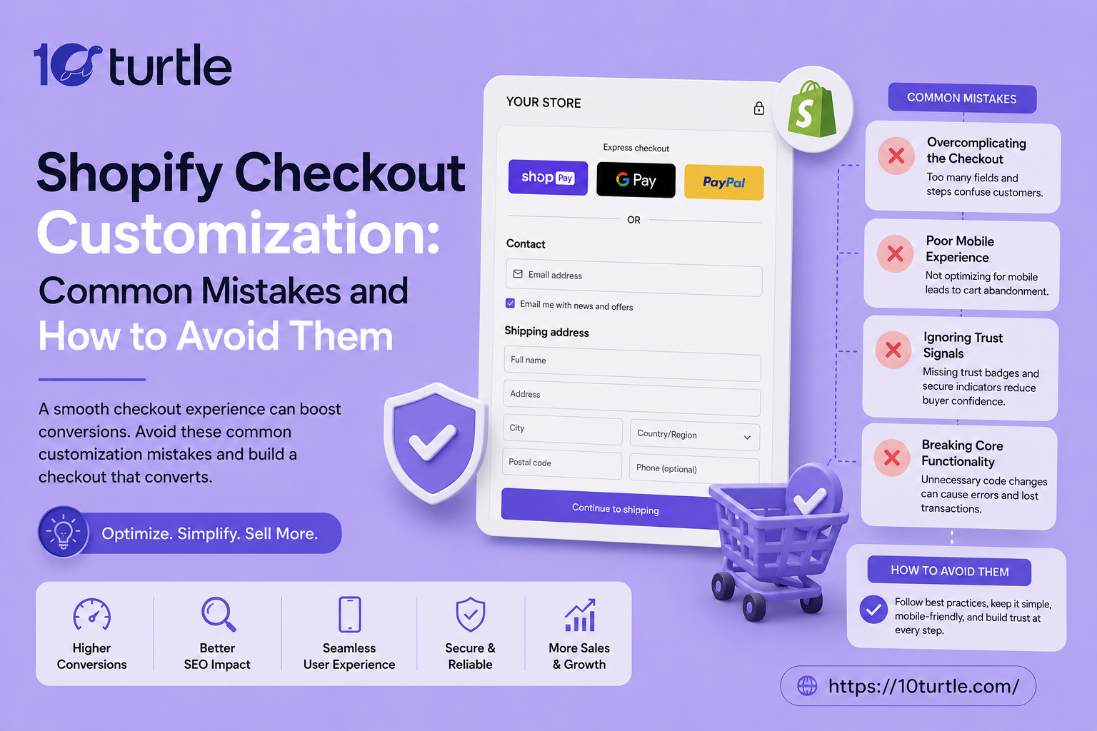
Running a Shopify store in the USA means your checkout page is the last impression before a sale actually happens, and even small checkout customization errors can quietly drain revenue every single day. Many merchants pour money into ads and product photography, then lose customers at the final step because of a clunky, confusing, or slow Shopify checkout flow. From skipping mobile optimization to ignoring the recent shift toward checkout extensibility, these missteps are more common than most store owners realize. This guide breaks down the most frequent checkout mistakes American Shopify sellers make and gives you practical, actionable fixes for each one.
Why Checkout Customization Matters More Than You Think
The checkout page isn't just a formality it's where trust is either confirmed or broken. According to industry data, average cart abandonment rates in the US ecommerce space hover around 70%, and a poorly optimized checkout experience is one of the biggest contributors. A clean, fast, and trustworthy custom checkout page can directly increase conversion rate optimization results without spending an extra dollar on traffic.
Mistake #1: Overloading the Checkout with Unnecessary Fields
One of the most common Shopify checkout mistakes is asking for too much information. Extra fields like company name, fax number, or a mandatory account creation step add friction that pushes shoppers away. Stick to essentials shipping address, payment details, and contact information. If you need marketing opt-ins, make them optional checkboxes rather than required steps.
How to fix it: Use Shopify's checkout editor to remove or hide non-essential fields, and only collect data you'll genuinely use for order fulfillment or customer service.
Mistake #2: Ignoring Mobile Checkout Experience
More than 70% of US shoppers now browse and buy from their phones, yet many stores still design checkout customizations with desktop screens in mind. Tiny buttons, cramped payment forms, and slow-loading mobile pages are silent conversion killers.
How to fix it: Test your mobile checkout optimization on multiple device sizes, prioritize thumb-friendly buttons, and make sure autofill works correctly for address and card fields.
Mistake #3: Limited Payment Method Options
American consumers expect flexibility. If your store only accepts credit cards and skips options like Shop Pay, Apple Pay, Google Pay, PayPal, or buy-now-pay-later services like Klarna or Afterpay, you're likely losing sales to competitors who offer more choices.
How to fix it: Enable multiple express payment options directly inside Shopify's payment settings, and place them prominently near the top of the checkout page for faster completion.
Mistake #4: Hiding Shipping Costs Until the Last Step
Surprise shipping fees are the number one reason shoppers abandon carts, according to Baymard Institute research. When customization efforts focus only on design and skip transparent pricing, the entire experience feels dishonest.
How to fix it: Display estimated shipping costs earlier in the shopping journey on the product page or cart page so nothing feels hidden by the time checkout begins. Consider a shipping calculator widget for added transparency.
Mistake #5: Overlooking Page Speed During Customization
Adding too many third-party checkout apps, custom scripts, or heavy tracking pixels can slow your checkout page dramatically. Every extra second of load time reduces the likelihood of a completed purchase.
How to fix it: Audit your installed apps regularly, remove anything unused, and lean on Shopify's native performance tools rather than stacking multiple bloated plugins for the same function.
Mistake #6: Missing the Shift to Checkout Extensibility
This is where many US-based merchants are currently getting caught off guard. Shopify has been moving away from checkout.liquid customizations toward its newer checkout extensibility framework, built on Shopify Functions and UI extensions. Stores still relying on older custom checkout scripts risk losing those customizations entirely or facing compatibility issues with app updates and platform changes.
How to fix it: If your store was built before this shift, audit your current checkout setup with your developer or agency to confirm you're using supported extensibility tools rather than legacy scripts. Migrating early avoids last-minute scrambling and keeps your customizations future-proof.
Mistake #7: No A/B Testing on Checkout Elements
Guessing what works rarely beats testing what actually works. Skipping experimentation on button colors, field order, or trust badge placement means missed opportunities for incremental conversion gains.
How to fix it: Run structured split tests on one variable at a time for example, testing a single-page checkout against a multi-step version and let real customer behavior guide your decisions.
Mistake #8: Weak Trust Signals at Checkout
Shoppers hesitate when a checkout page feels unfamiliar or unclear. Missing SSL indicators, unclear return policies, or no visible customer support contact can quietly raise doubt at the worst possible moment.
How to fix it: Add small but meaningful trust elements a security badge, a link to your return policy, and a visible support email or chat option right on the checkout screen.
FAQs
Q1: Can all Shopify plans customize the checkout page?
Basic branding customization (colors, logo, fonts) is available on every plan, but deeper structural changes and checkout extensibility apps typically require Shopify Plus or specific eligible plans.
Q2: Is checkout.liquid still usable in 2026?
Shopify has been phasing out checkout.liquid in favor of checkout extensibility, so stores still using it should plan a migration to avoid losing customization support.
Q3: How much does a slow checkout page actually cost a store?
Even a one-second delay can measurably lower conversion rates, especially on mobile, making speed one of the highest-impact areas to fix first.
Q4: What's the easiest first step to improve checkout conversions?
Start by reducing unnecessary form fields and adding at least one express payment option both are quick wins with minimal development effort.
Q5: Should every store use one-page checkout?
Not always. Simpler product catalogs often benefit from a streamlined one-page flow, while stores with complex shipping or customization options sometimes perform better with a clear multi-step process. Testing is the only reliable way to know for sure.
Final Thoughts
Shopify checkout customization isn't a one-time task it's an ongoing process of removing friction, building trust, and staying current with platform changes like checkout extensibility. By addressing these common mistakes early, US-based merchants can turn their checkout page from a leaky bucket into one of their strongest conversion tools.

 English
 Arabic
 French
 Spanish
 Portuguese
 Deutsch
 Turkish
 Dutch
Dutch
 Italiano
 Russian
 Romaian
 Greek
Greek